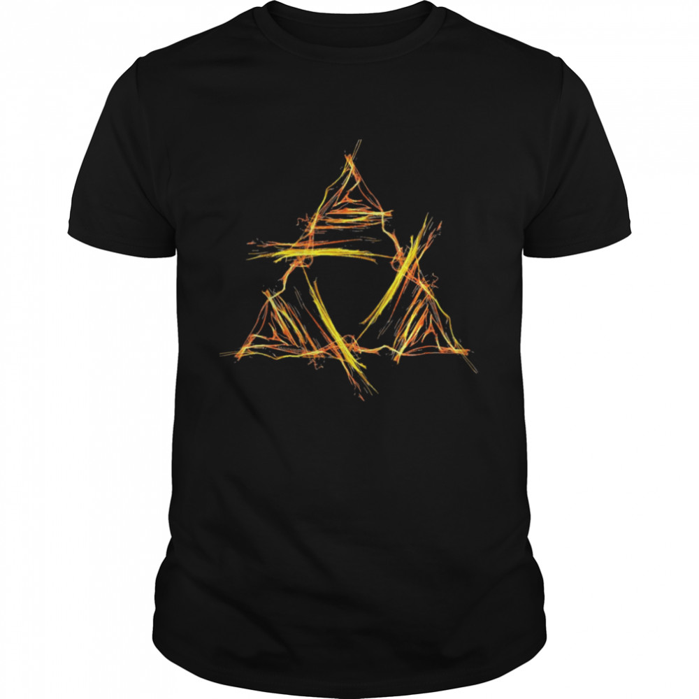
Cody Rhodes X Vegas Golden Knights 2024 Finish The Story T-Shirt
$27.99 Original price was: $27.99.$19.99Current price is: $19.99.

Cody Rhodes X Vegas Golden Knights 2024 Finish The Story T-Shirt, hoodie, sweater, longsleeve and ladies t-shirt





You Can See More Product: https://kingteeshop.com/product-category/trending/
1. Order Processing Time
-
Order Handling: Orders are typically processed within 2–5 business days after successful payment.
-
Made-to-Order Production: Since many of our items are printed on demand, production may take a little longer during high-volume periods (e.g., holidays).
-
Orders placed on weekends or public holidays will be processed on the next business day.
2. Shipping Time Estimates
We ship worldwide. Estimated delivery times (after processing) are:
| Region | Estimated Delivery Time |
|---|---|
| United States | 5–10 business days |
| Canada | 7–12 business days |
| United Kingdom | 7–12 business days |
| Australia | 7–14 business days |
| Europe | 7–15 business days |
| Rest of World | 10–20 business days |
🕐 Note: Delivery times are estimates and may vary due to customs delays, carrier disruptions, or other unforeseen circumstances.
3. Shipping Rates
Shipping costs are calculated at checkout and vary depending on:
-
Shipping destination
-
Weight and quantity of items ordered
-
Current shipping carrier rates
We may offer free or discounted shipping promotions from time to time — be sure to check banners or newsletters for updates.
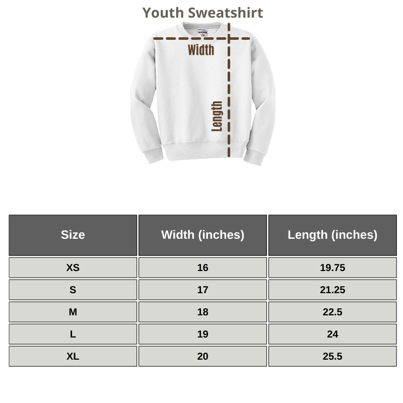
SIZING GUIDE
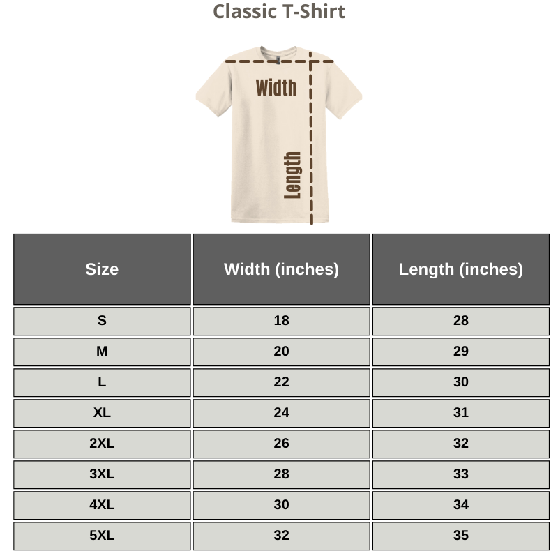
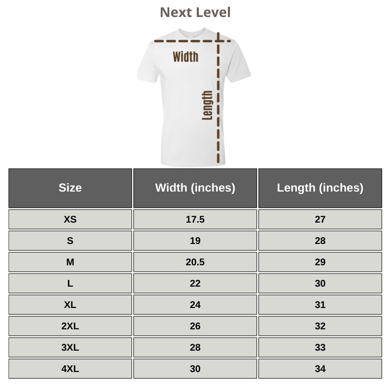
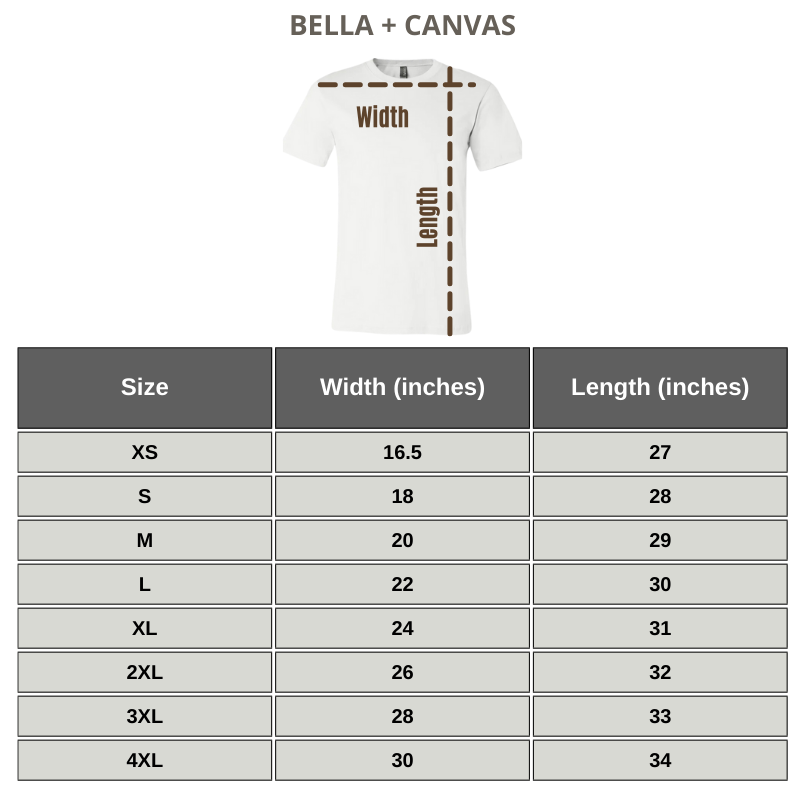
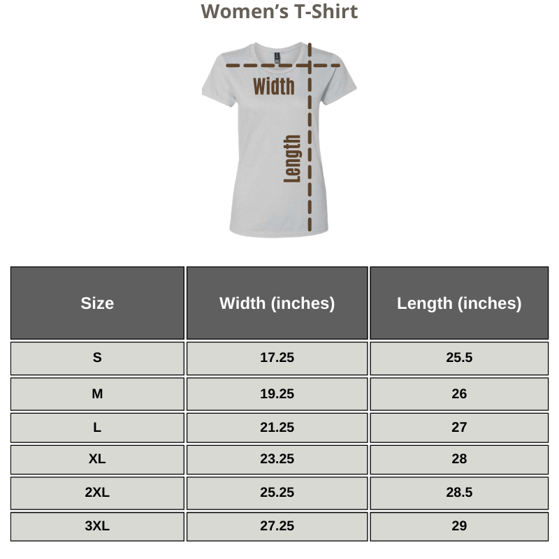
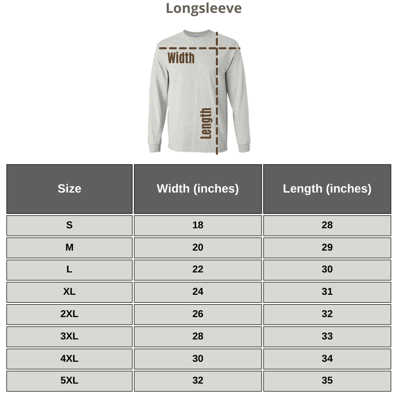
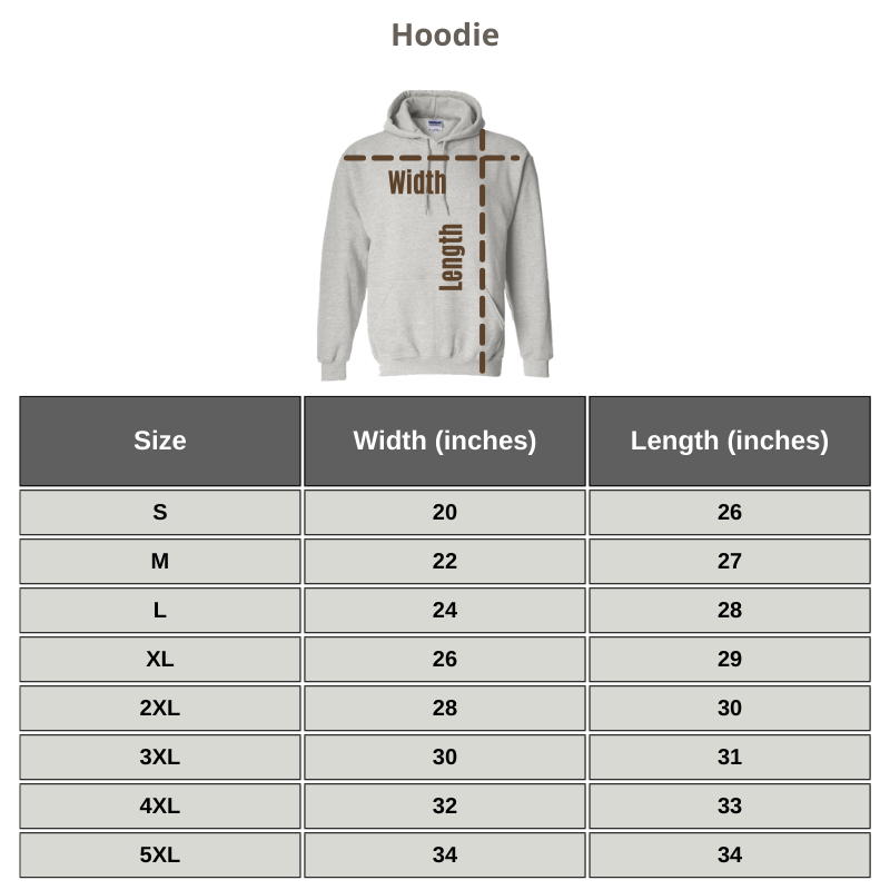
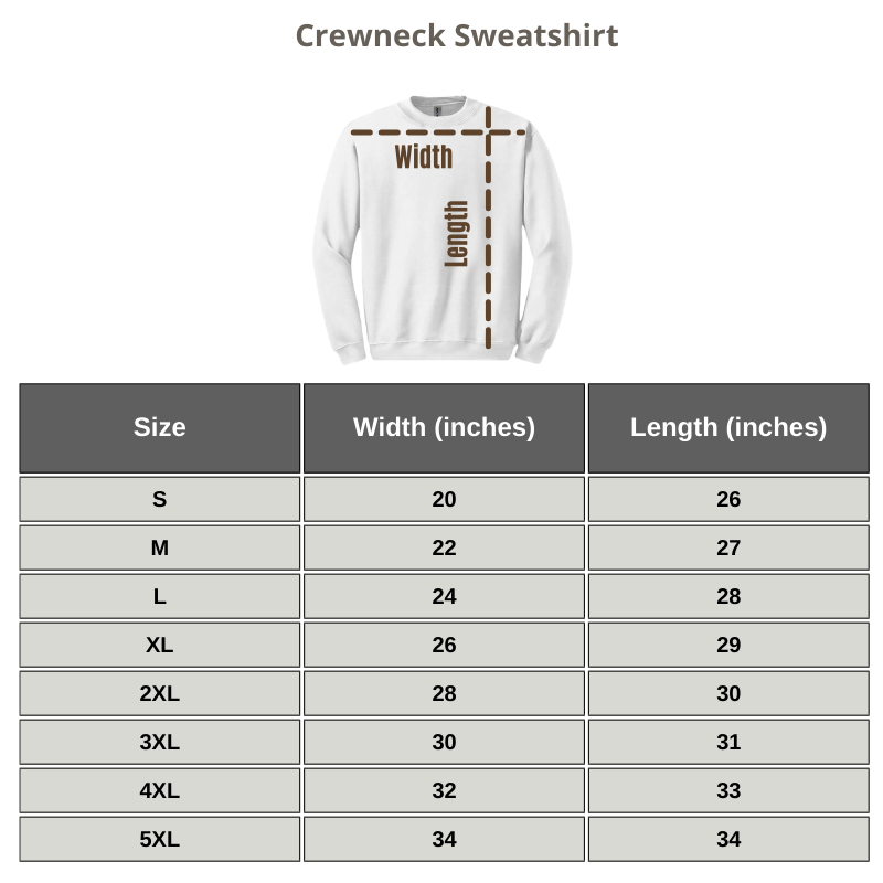
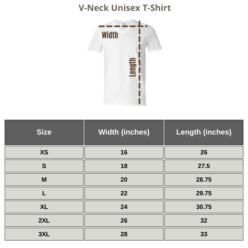
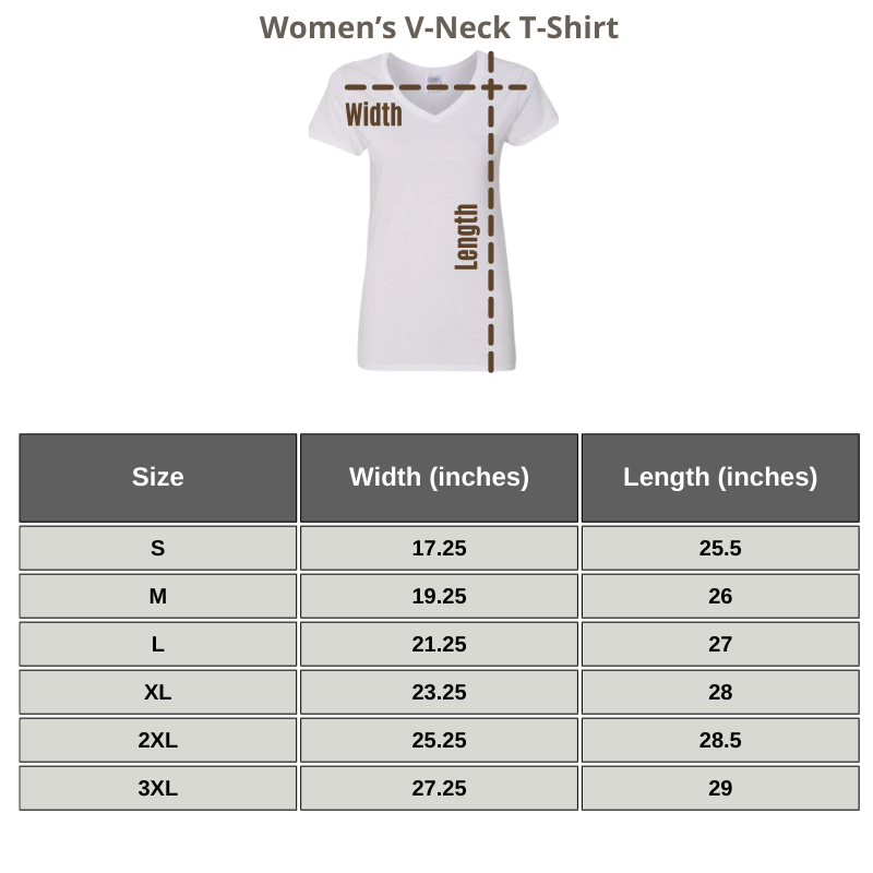
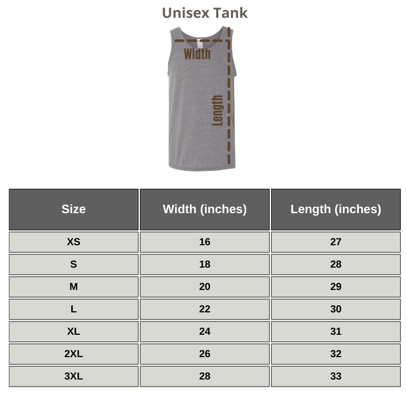
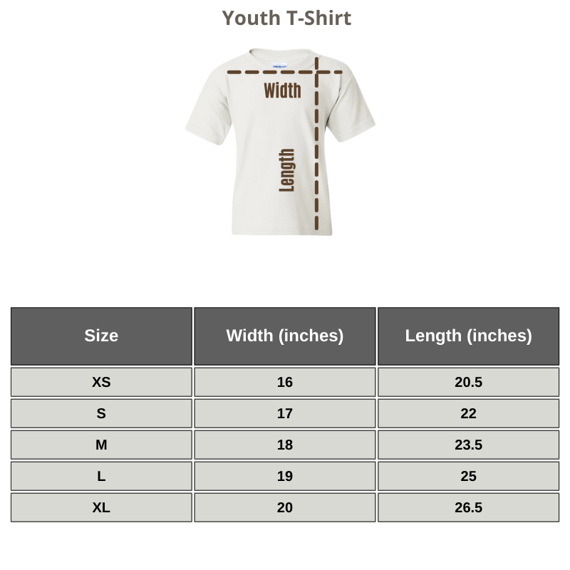
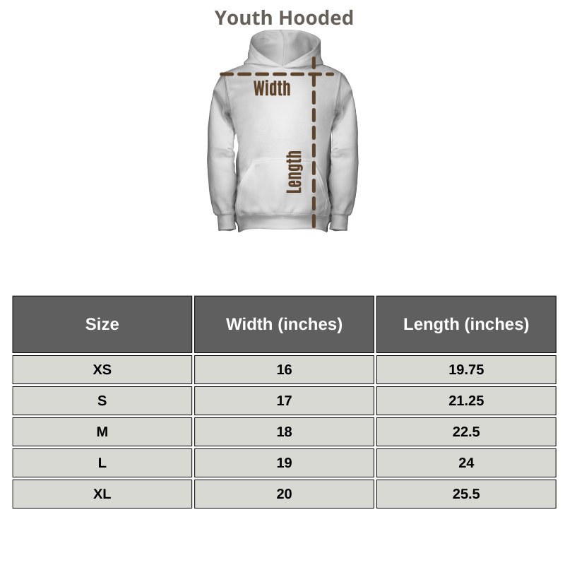







Reviews
There are no reviews yet.